Digital Marketing
CTA Button Placement: Best Practices for Landing Pages
Where to place CTA buttons on landing pages, design mobile-friendly high-contrast CTAs, and use testing to improve click-through and conversions.

A well-placed call-to-action (CTA) can make or break your landing page's success. Even with great design and copy, poor placement can confuse visitors, lower engagement, and reduce conversions. Here's what you need to know:
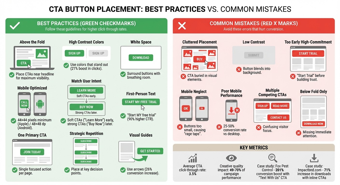
CTAs above the fold grab attention immediately. Place them near your headline for maximum visibility.
Use high-contrast colors and white space to make buttons stand out. Test visibility with the "Squint Test."
Match CTAs to user intent: Softer CTAs like "Learn More" work early, while stronger ones like "Buy Now" should appear later.
Mobile optimization is essential. Buttons should be easy to reach and large enough to tap.
Avoid clutter and focus on one primary CTA per page to reduce confusion.
Want better results? Test placement with tools like heatmaps and A/B tests to find what works best for your audience.
CTA Button Placement Best Practices vs Common Mistakes Comparison
Common CTA Button Placement Mistakes
Getting the placement of your call-to-action (CTA) buttons right is critical for driving conversions. Missteps in this area can easily derail potential leads, making it harder for users to take the next step. Even with the best intentions, businesses can unintentionally create barriers to action. Let’s explore some common mistakes that can harm visibility and disrupt the user’s journey.
Placing CTAs in Cluttered Areas
When a CTA is buried in a sea of images, text, or other visual elements, it can become practically invisible to users - a phenomenon often referred to as "ignoring the CTA" [10]. On top of that, using a color scheme that blends your CTA into the background can further diminish its impact [11]. As Michael Aagaard, a Senior CRO Expert, puts it:
"Button design is a visual cue that helps attract prospects' attention to the call-to-action. In other words, button design answers the question, 'Where should I click?'" [7]
One quick way to test if your CTA stands out is the "Squint Test." Simply squint at your page - if the button doesn’t immediately catch your eye, it’s time to enhance its contrast or add some white space around it. This extra breathing room can make a world of difference in drawing attention to the button [3] [5] [11].
But visual clarity isn’t the only factor - your CTA also needs to align with where users are in their decision-making process.
Ignoring Where Users Are in Their Decision Process
Dropping a high-commitment CTA like "Start My Free Trial" too early in the customer journey can scare off visitors who are still exploring your offering [10]. For users in the early stages, softer prompts like "Learn More" or "See How It Works" are much more effective. Save the stronger calls to action for later, once trust has been established and the user is ready to take the next step [3].
Forgetting Mobile Users
Another common oversight? Neglecting the mobile experience. Mobile users interact with your site differently than desktop users - they’re often multitasking or on the move. For these users, initiating a simple action (like starting a conversation) might feel more manageable than completing a detailed transaction [12]. Unfortunately, many landing pages fail to prioritize mobile usability, leading to frustrating "rage taps" on buttons that are too small or unresponsive [9].
Mobile conversion rates typically lag behind desktop rates, often ranging from just 25-50% [12]. One reason for this is poorly designed buttons. Apple’s Human Interface Guidelines recommend a minimum touch target of 44×44 pixels, while Android suggests 48×48 dp [13] [14] [9]. Buttons that don’t meet these standards can result in "fat-finger" errors, where users accidentally tap the wrong element [5] [9].
To improve mobile usability, position key CTAs near the bottom of the screen, where they’re easy to reach with a thumb. Surround these buttons with ample white space to prevent accidental clicks, and always test your landing pages on actual devices to ensure a smooth experience [9] [13]. By addressing these issues, you can create a seamless, conversion-friendly experience for users on any device.
How to Place CTA Buttons for Better Results
Now that you’re aware of what to avoid, let’s dive into the strategies that actually work. Placing your Call-to-Action (CTA) buttons thoughtfully can significantly boost your conversion rates - no need for a complete landing page overhaul.
Put CTAs Above the Fold with Clear Value
Start by positioning your CTA where it grabs immediate attention. For pages with large hero images, place the button just below your main headline - this aligns with natural eye movement patterns [15]. Pair it with a headline that highlights the benefit visitors will gain, making the value crystal clear.
Your button should be unmissable. Use high-contrast colors that stand out against your background; studies show this can boost clicks by 21% [9]. Surround the button with plenty of white space to make it pop visually [3]. A quick way to test visibility is the Squint Test: if your button stands out when you squint, you’re on the right track [3].
For pages with complex offers, use softer CTAs like "Learn More" or "See How It Works" at the top. Reserve stronger CTAs like "Start My Free Trial" for later, once visitors have had time to build trust. A small but impactful tweak? Change your button text from second-person to first-person. For example, Unbounce found that switching "Start your free 30-day trial" to "Start my free 30-day trial" increased click-through rates by 90% [6].
Add CTAs in the Middle of Your Page
Don’t rely solely on a top-of-page CTA. Place additional buttons after sections that outline your benefits or feature customer testimonials. These mid-page CTAs appeal to visitors who need more information before they’re ready to take action. By strategically placing buttons throughout your content, you can engage users at key decision points.
Keep your button text short and action-focused. High-performing CTAs often use just 3 to 4 words, and phrases like "Download My Free Checklist" make the action clear and enticing [9].
Use Visual Guides for Lower CTAs
As visitors scroll further down your page, visual cues can help guide them toward your CTA. Adding arrows or directional graphics can snap users out of passive browsing and direct their attention to your button - this simple addition can increase conversions by 26% [6]. You can also use images of people looking toward the CTA to naturally draw the eye [14].
Sticky elements, like a navigation bar or footer that follows users as they scroll, can keep your CTA accessible without cluttering the page [14].
Repeat CTAs Without Overdoing It
Repeating CTAs can be effective if you place them at critical decision points. However, ensure all buttons lead to the same goal to avoid confusing your visitors.
Use one consistent, standout color for all CTAs on your site. This trains users to recognize it as the primary action point [14]. Adding trust-building elements - like brief testimonials, trust badges, or a "no credit card required" note - near your buttons can also help reduce hesitation [6].
Optimize CTAs for Mobile Screens
Mobile users interact differently with landing pages, so adapt your CTA strategy for smaller screens. Place your most important buttons near the bottom of the screen where they’re easy to tap with a thumb [9]. Make sure buttons are large enough to meet touch target standards and avoid accidental taps [9].
Sticky footers work especially well on mobile, keeping your CTA visible as users scroll [14]. Use generous white space around the buttons to prevent misclicks, and always test your design on real devices to ensure a smooth user experience.
Using Data to Improve CTA Placement
Placing your CTA buttons is just the beginning; the real challenge lies in ensuring they perform. Data can help you identify where your audience engages with CTAs and where they might be ignored. From there, you can experiment with different placements to uncover the most effective spots.
Test Different CTA Positions
A/B testing is a powerful way to validate your ideas about CTA placement. Focus on testing one variable at a time - such as the button's position - while keeping other elements like text, color, and size consistent. Tools like heatmaps and scroll maps can reveal where users interact most on your page and where they lose interest [5][9][1][4]. These tools highlight "hotspots" that draw attention and "dead zones" where engagement drops off. If your CTA is stuck in a dead zone, moving it to a hotspot could significantly increase clicks.
Take Fox Pest Control, for example. In August 2025, they ran an A/B test with Leadferno, swapping out a standard phone-based CTA for a "Text With Us" widget. This simple adjustment led to a 201% boost in conversion rates and tripled their leads in just over a month - without increasing traffic [9]. Another example comes from Impactbnd.com, which removed sidebar CTAs and instead embedded inline forms within their content, resulting in a 71% increase in ebook downloads [16].
For best results, consider the intent of your audience. Place "soft" CTAs like "Learn More" at the top of the page for those still gathering information, while "high-intent" CTAs like "Buy Now" are better suited for users ready to act [9]. If you're selling complex products, placing CTAs below the fold - after users have had a chance to absorb more details - often works better [4].
Track Performance with Real-Time Data
Once your CTAs are live, use real-time data to refine their placement. Key metrics like click-through rate (CTR) can show whether your button is catching attention. For reference, the average CTR for a CTA is around 3.5% [1]. Conversion rates, meanwhile, help you assess whether your CTA placement aligns with user intent. If you notice a high bounce rate after clicks, it may indicate that the CTA isn't delivering on its promise [18].
Session recordings and analytics can also highlight friction points. For instance, pop-ups might block your CTA on mobile devices, or layout shifts could push buttons out of view [1][19][20]. Analytics reports can show which elements users are clicking on. If they're clicking non-clickable areas instead of your button, it’s time to reposition your CTA to a more effective spot [1][20].
"Just because something won once, doesn't mean it can't be beat. Keep going." - Carly Stec, Team Manager for Blog and Academy Acquisition, HubSpot [17]
Optimization is an ongoing process. Even small adjustments - like tweaking white space, shifting a button a few pixels, or using first-person language - can lead to big improvements. Let real user behavior guide your decisions, and keep testing incrementally. These insights will set the stage for even more effective CTA strategies down the road.
How Dancing Chicken Helps Optimize Your CTAs

Getting your call-to-action (CTA) just right isn’t just about slapping a button on a page. It’s about understanding how users interact with your content, from the moment they click to the point they convert. Dancing Chicken tackles common CTA placement challenges with a mix of strategic consulting and data-driven insights. By integrating a well-rounded Meta Ads strategy, they ensure your ad creatives and landing page CTAs work together seamlessly to turn clicks into revenue. As Samuel Edwards, CMO of PPC.co, puts it:
"Automation can never tell you why people click, bounce, or buy. That's where humans are and always will be needed." [8]
Let’s dive into how Dancing Chicken’s services fine-tune every aspect of CTA optimization.
Meta Ads Consulting for Better Lead Generation
Dancing Chicken goes beyond simply managing ad bids and impressions. Their consulting services take a broader approach, focusing on the entire user journey. They tailor CTA placement to match where users are in their decision-making process. For instance, early-stage users might respond better to softer CTAs like “Learn More,” while more decisive options like “Start My Trial” are reserved for users ready to act. With creative quality accounting for 49%–70% of campaign performance [8], they ensure CTAs are not only well-placed but also compelling and visible.
Ad Account Audits and Landing Page Reviews
Dancing Chicken’s audits dig deep to uncover what’s working - and what’s not - when it comes to your CTAs. Using tools like heatmaps and scroll maps, they pinpoint “dead zones” where user engagement drops and “hotspots” that naturally draw attention [1][21]. For example, when Impactbnd.com ditched distracting sidebar CTAs in favor of a single inline form, they saw a 71% jump in ebook downloads [16].
Their audits also ensure your CTAs are mobile-friendly, checking that buttons meet platform standards [5][22]. Plus, they apply the “squint test” to guarantee that your CTA stands out as the most prominent element on the page [7][3].
Real-Time Analytics Dashboard
Optimization doesn’t stop at audits. Dancing Chicken’s real-time analytics dashboard provides ongoing insights into CTA performance across devices and campaigns. By tracking metrics like click-through rates, conversion rates, and cost-per-lead [2][5], the dashboard helps identify areas for immediate improvement. It even integrates heatmap and scroll map data to highlight non-interactive zones, ensuring your CTAs stay in the spotlight [1]. With the average landing page CTA achieving a 3.5% click-through rate [1], this constant feedback loop enables quick adjustments to maximize results.
Conclusion
Review of Common Errors and Fixes
When it comes to CTA placement, the most common mistakes often involve issues with visibility and timing. Think about CTAs buried in cluttered sections, buttons with low-contrast colors that blend into the background, or mobile buttons that are too small to tap comfortably - these all lead to missed opportunities for conversions. The solution? Start by placing your primary CTA above the fold, where it’s immediately noticeable. Choose high-contrast colors that pass the "squint test" (if you squint and the button still stands out, you’re good), and ensure mobile CTAs are large enough to meet the recommended touch target sizes. For longer landing pages, it’s helpful to repeat a single, clear CTA at strategic points to catch users at different stages of their decision-making process [14]. Also, sticking to one focused CTA per page helps eliminate distractions and keeps visitors on track. These adjustments are simple but can make a big difference in avoiding common pitfalls and driving meaningful results.
Why CTA Placement Matters for Growth
Getting CTA placement right doesn’t just improve user experience - it can directly impact your growth metrics. Your CTA often determines whether a visitor bounces or converts [7]. Visitors need a clear next step; without it, they’re likely to leave without taking action [1]. Thoughtful placement of CTAs can also amplify your marketing efforts. For example, smarter placement can double your conversion rates and significantly reduce your cost per acquisition. Considering that the average landing page CTA achieves a 3.5% click-through rate [1], even small tweaks in placement and design can lead to noticeable revenue gains. Whether you’re running paid campaigns on platforms like Meta Ads or optimizing organic landing pages, nailing your CTAs is one of the quickest ways to boost lead generation and improve ROI. Every thoughtful detail in CTA placement strengthens your page’s ability to convert visitors into leads, ultimately driving better results for your business.
FAQs
Why is it important to place the CTA button above the fold?
Placing your CTA button above the fold ensures it’s one of the first things visitors see when they land on your page - no scrolling required. This prime positioning grabs attention instantly, boosting the chances of engagement and increasing conversion rates.
When users can easily find and click your CTA without extra effort, it creates a smoother experience and encourages them to take action. It’s a simple yet powerful way to optimize your landing page for generating leads.
What are the best practices for optimizing CTA buttons on mobile devices?
To make CTA buttons more effective for mobile users, focus on making them easy to tap. The touch area should be at least 44×44 pixels to accommodate fingers comfortably. Position the button in the "thumb zone" - the lower-right area of the screen that’s easiest to reach - and ensure it’s visible above the fold, so users don’t need to scroll to find it. Surround the button with plenty of whitespace to reduce accidental taps, and select a color that sharply contrasts with the background for better visibility.
When designing, prioritize mobile-first principles. Use fonts that are large and easy to read (at least 14 pt) and keep the text short, clear, and action-driven - phrases like "Get Started" or "Claim My Offer" work well. Make sure the button adapts seamlessly to different screen sizes with responsive design, and aim for load times of under one second to keep users engaged. Experimenting with A/B tests for elements like color, text, and placement can provide insights into what resonates most with your audience. For additional help, Dancing Chicken offers specialized mobile consulting to enhance lead generation and boost CTA performance.
What are the most common mistakes to avoid when placing CTA buttons on a landing page?
Avoid these common missteps when placing CTA buttons on your landing page if you want to boost conversions:
Tucking the button away in hard-to-spot areas: If your CTA is buried below the fold, hidden in sidebars, or lost within a block of dense text, people might miss it entirely. Place it where it grabs attention - like above the fold or right after a compelling section.
Using bland or unclear wording: Labels like "Submit" or "Click Here" don’t tell users what they’re signing up for. Instead, go for action-oriented phrases that highlight the benefit, such as "Claim Your Free Trial" or "Download My Guide."
Designing buttons that don’t stand out: A button that blends into the background or is too tiny to notice can easily be skipped over. Make sure it pops with a contrasting color and is large enough to be easily clickable, particularly on mobile devices.
Fixing these mistakes ensures your CTAs are both eye-catching and strategically placed, making it easier for visitors to take action and boosting your chances of driving conversions.
Related Blog Posts
5 Signs Your Meta Ad Creative Underperforms
How To Test Landing Pages for Meta Ads
Ultimate Guide to Landing Page Design for Meta Ads
Ultimate Guide to Landing Page Copy for Meta Ads