Landing pages that mirror your Meta Ads and use focused headlines, clear CTAs, social proof, and A/B testing convert far better.
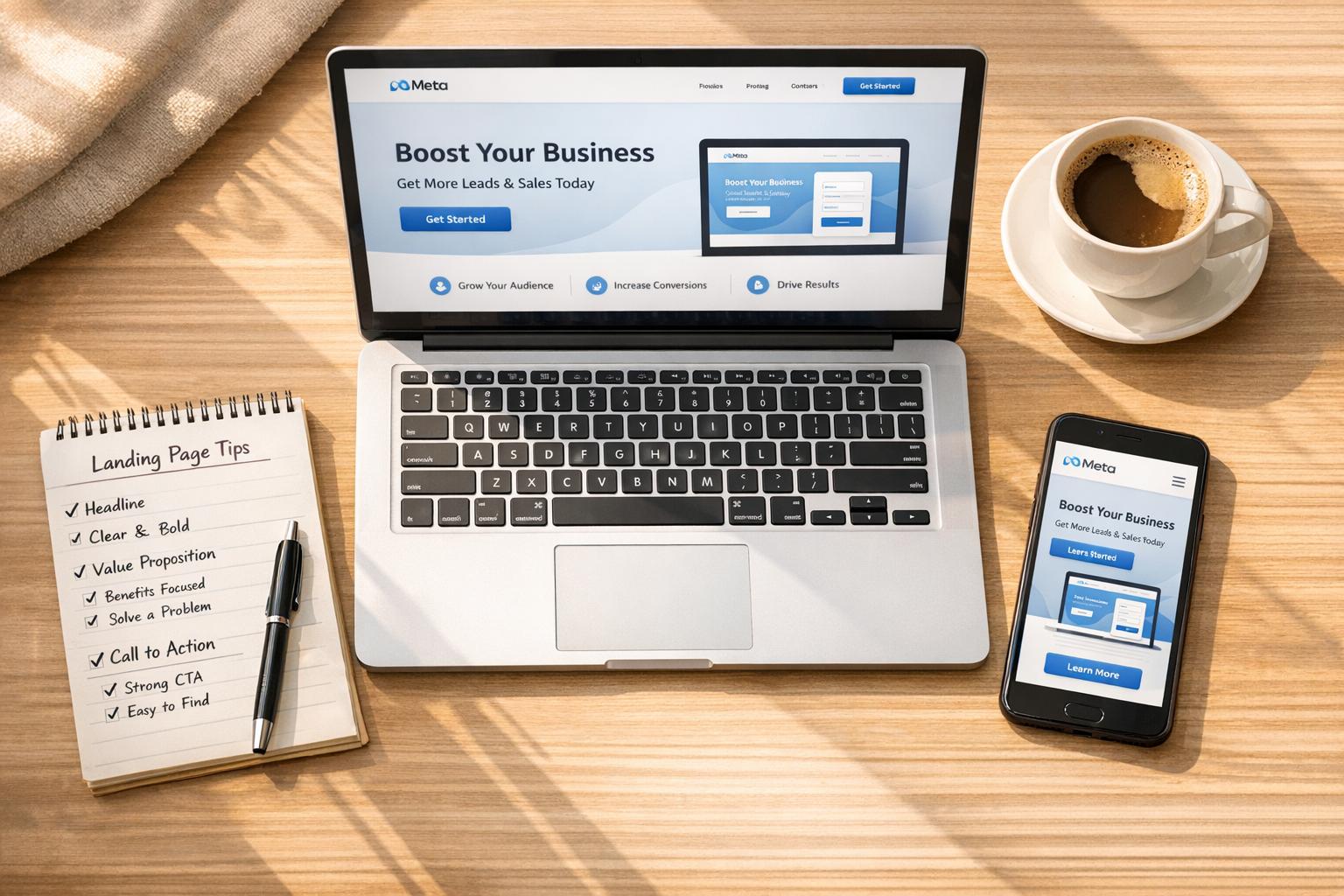
Your Meta Ads won't convert without effective landing page copy. Ads may bring the traffic, but it's your landing page that turns clicks into customers. The key? Consistency between your ad's promise and your page's content, paired with clear, actionable messaging.
Here’s what you’ll learn:
Takeaway: Your landing page should align with your ad, focus on a single goal, and continually evolve through testing. Let’s make your ad spend pay off.
Your headline is everything. Studies reveal that while 8 out of 10 people will read your headline, only 2 out of 10 will stick around for the rest of the content [3]. You’ve got less than 3.4 seconds to grab attention and prevent bounces [6]. For Meta Ads traffic, this is even more crucial since users scroll quickly and demand instant clarity.
Here’s the golden rule: your headline must match your Meta Ad perfectly. If your ad says, "50% Off Your First Order", your headline needs to say exactly that. Even a slight rewording can break trust and send visitors packing. As Leadpages explains, "A well-written headline aligns with the ad, email, or social media post that led the visitor to the page. If there's a disconnect... users may lose trust and exit the page" [3]. At Dancing Chicken, we stick to this principle religiously, ensuring every landing page mirrors the exact language of the ad to maintain trust and consistency.
Focus on benefits, not features. Instead of saying "Advanced CRM Software", go with something like "Close More Deals in Half the Time." Headlines that are between 6 and 12 words tend to perform best - keep them concise and specific [3]. Try the 4-U Formula to craft your headline: make it Useful (solve a problem), Unique (stand out), Urgent (add time sensitivity), and Ultra-specific (use precise numbers like "47% increase" instead of vague claims) [2][3][6].
Certain words immediately grab attention. Words like "Exclusive", "Proven", "Instant", and "Effortless" create engagement on the spot [3]. Use Title Case for your headlines - it’s a standard practice that can improve readability [6]. Above all, clarity wins over cleverness. A simple, value-packed headline will always outperform one that’s overly witty or hard to decipher.
For Meta Ads traffic, three headline formulas stand out. First, the How-To formula ("How to Generate 300% More Leads in 30 Days") promises a clear outcome and appeals to solution-aware visitors. Second, the Question formula ("Struggling with Low Conversions?") directly addresses pain points, making it highly relevant. Lastly, the Testimonial formula ("Join 10,000+ Businesses Already Scaling Revenue") leverages social proof to build credibility [3].
Creating urgency is another effective tactic. Use time-sensitive phrases like "Limited Time" or "Today Only", paired with specifics like "Save $200 This Week", to prompt immediate action. Address common objections upfront with phrases like "No Credit Card Required" or "Cancel Anytime" to ease hesitation [2][6].
For mobile users - where most Meta Ad clicks happen - keep your headlines under 40 characters to avoid being cut off [4][5]. The goal is to stop the scroll with a clear, instantly understandable offer.
If your headline grabs attention, your subheadline seals the deal by adding context and detail [7][8]. For example, if your headline promises "Double Your Sales", your subheadline could explain, "Our Proven 5-Step Framework in 15 Minutes."
Keep subheadlines between 10 and 15 words and use them to expand on your Unique Selling Proposition. Instead of saying "24/7 Support", try "Get Help Whenever You Need It So You Never Get Stuck" [7][5].
"A conversion subheadline should be informative, supportive, and specific. It should elaborate on the headline and provide more information that the visitor needs to know before making a decision."
– FasterCapital [8]
Subheadlines are also a great place to incorporate social proof, like "Trusted by 50,000+ Customers", or stats that boost your credibility. Use the "Clarity, Relevance, Value" framework: ensure your subheadline clarifies the offer, connects to the reader’s needs, and highlights the results they can expect [8]. To make sure it’s noticed, use clear typography and position it above the fold [7][9].
For Meta Ads traffic - especially on platforms like Instagram Stories or Reels where ad copy is limited - your subheadline plays a major role in filling in missing details. A/B test different approaches, such as benefit-driven versus curiosity-based subheadlines, to discover what resonates most with your audience [7][3].
Once you’ve nailed your headlines and subheadlines, the next step is mastering copywriting frameworks to take your landing page to the next level.
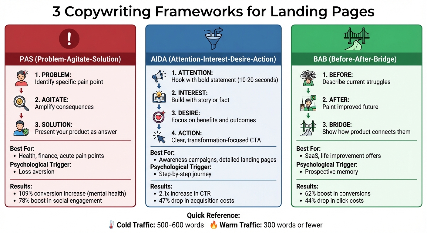
3 Copywriting Frameworks for High-Converting Landing Pages: PAS vs AIDA vs BAB
Creating effective landing page copy for Meta Ads starts with a clear and proven structure. These frameworks guide visitors from identifying a problem to finding a solution, helping to drive action across various awareness levels.
Each method taps into different psychological triggers: PAS focuses on addressing pain points, AIDA takes users through a logical journey, and BAB helps them visualize a better future. Let’s dive into how each framework works and how they can shape your landing page copy.
This framework organizes your landing page by addressing a problem, amplifying its impact, and providing a solution. It’s a great way to align your page with the promise of your Meta Ad.
"The goal is to not agitate too much but rather help prospects fully recognize the importance of addressing their challenge."
– Ihar Vakulski, Founder of SaaSFunnelLab [10]
AIDA leads visitors through a step-by-step journey, from grabbing their attention to motivating them to act. It’s ideal for creating engaging, action-driven pages.
For cold Meta Ad traffic, 500–600 words may be needed to guide visitors through these stages. Warm traffic, however, often converts with 300 words or fewer [1].
"AIDA isn't just a formula - it's a behavioral map. And when used intentionally, it creates a frictionless path from curiosity to conversion."
– Arjun Patel, Marketing Specialist at Dool Agency [11]
BAB uses storytelling to contrast the visitor’s current reality with an improved future, positioning your product as the bridge between the two.
"People don't pay for parts. They pay for better selves - and BAB shows them just what that is."
– Arjun Patel [11]
BAB works particularly well for transformative offers like SaaS, financial tools, and life coaching. In Meta Ads, where users often already recognize their pain points, starting with a specific "Before" scenario can instantly create empathy [2].
| Framework | Focus | Best Use Case | Psychological Trigger |
|---|---|---|---|
| PAS | Emotional pain and relief | Health, finance, acute pain points | Loss aversion |
| AIDA | Logical progression | Awareness campaigns, detailed landing pages | Step-by-step journey |
| BAB | Transformation and future state | SaaS, life improvement offers | Prospective memory |
These frameworks provide a reliable foundation for crafting effective landing pages. Up next, we’ll explore the key elements that can amplify their impact.
After selecting a framework, the next step is structuring your landing page to focus on elements that genuinely drive action. When visitors arrive via Meta Ads, they come with specific expectations, and your page needs to meet those expectations immediately.
The content visitors see first - the above-the-fold section - sets the tone for their entire experience. In 2019, Promo saw a 46.94% conversion rate by featuring a dynamic header video, a clear value proposition, and a single, compelling call-to-action (CTA). As Yael Miriam Klass noted, straightforward text combined with a clear CTA above the fold is non-negotiable [14].
Start with a headline that clearly explains what you're offering and why it matters. Follow this with a sub-headline that either tackles a common objection or expands on the core benefit. Pair this messaging with a hero image or video that shows your product in action, helping visitors immediately picture the outcome. Adding video can boost conversion rates by up to 80% [14].
Your CTA should be singular and focused - too many options can hurt your conversion rates. In fact, pages with multiple CTAs see conversion rates drop by 266% [17]. Use action-driven language like "Get Your Free Audit" instead of vague terms like "Submit." For lead generation campaigns, place forms above the fold. For example, ooba, a finance company, achieved a 35.57% conversion rate by positioning their lead generation form at the top of the page. CEO Adam Lange explained, "The form is positioned at the top of the page, above the fold, which makes the action we want the user to take clear from the outset" [14].
Since 83% of all landing page visits happen on mobile devices [14], ensure your key information and CTA are visible without requiring users to scroll. College Board, for instance, achieved a 77.38% conversion rate for SAT registrations by adding a countdown timer just below the top CTA to create a sense of urgency [14].
Once you've nailed the above-the-fold content, it's time to build trust with social proof.
After making a strong first impression, social proof reinforces trust and helps visitors feel confident in their decision. It’s especially powerful when users are unfamiliar with your brand. For example, edX achieved a 52.68% conversion rate on their online course landing pages by combining a clear headline and sub-headline with immediate social proof. As Senior Growth Marketer Josh Grossman put it, "In our testing, shorter copy worked better than longer copy. Either you want to learn Python, or you don’t" [14].
Effective social proof can take many forms, including customer testimonials, review scores, industry awards, expert endorsements, or logos of trusted brands that use your product [2][15]. The impact is even stronger when the proof comes from groups similar to your target audience. For example, the UK government increased on-time tax payments from 67% to 72% by adding the phrase, "The vast majority of British citizens pay their taxes on time", to their letters. Localizing the message to specific towns pushed compliance rates even higher, up to 83% [15].
Strategically position social proof to address specific visitor concerns. For example, if someone is wondering, "Does this actually work?" place testimonials near the CTA. If they’re asking, "Who are these people?" include a logo bar of recognizable brands near the headline. SEMRush takes a layered approach by combining a logo bar, a list of industry awards, and a live Twitter feed showcasing real-time user feedback [16].
Always use real testimonials and reviews. Fake ones violate ethical standards and can destroy brand trust [15]. To make testimonials relatable and credible, include details like customer photos, names, and social media handles [16].
Next, let’s tackle visitor objections and lingering questions.
Every visitor has concerns - your landing page should address them head-on. Anticipating and resolving these hesitations can prevent them from becoming reasons to leave. Start by mapping out potential objections and creating a clear hierarchy of information to address them as users scroll [2].
Use microcopy around CTAs to reduce friction, such as "No credit card required" or "Get a quote in 60 seconds." These small assurances can make a big difference when visitors are deciding whether to act [17].
Drop-down FAQs are another effective way to answer questions like pricing or technical requirements without overwhelming the page design. For example, Bariatric Eating achieved a conversion rate of over 39% by using a friendly, approachable design that included a collapsible FAQ section alongside social proof to address dietary concerns [16]. Be upfront about requirements - such as age, location, or necessary equipment - to set clear expectations and avoid wasting time for unqualified leads [16].
When describing features, focus on the benefits they deliver. Instead of saying "large grass bag" for a mower, highlight how it "reduces trips to empty the bag so you finish faster" [2]. Avoid vague claims like "the best" or "the quickest." Instead, use specific data, such as "results in 48 hours" or "trusted by over 3.8M websites" [17].
| Strategy | Implementation Example | Friction Reduced |
|---|---|---|
| Click Trigger | "No credit card required" under a CTA | Financial risk/commitment |
| Objection CTA | "Get a quote in 60 seconds" | Time investment concerns |
| Drop-down FAQ | Collapsible "How much does it cost?" | Information overload |
| Social Proof | "Join 125,000+ other marketers" near form | Trust and credibility issues |
| Qualifying Info | "Must be 18+ with a valid driver’s license" | Unqualified lead frustration |
Write copy that speaks directly to the visitor using "you" and "your" to create a conversational tone. This helps users imagine themselves using your product. Interestingly, changing "your" to "my" in a CTA (e.g., "Start My Free Trial") has been shown to increase conversions by 90% [17]. Lastly, restate your value proposition at the bottom of the page with fresh wording, emphasizing a secondary benefit or addressing a new concern [17].
With 83% of landing page visits coming via mobile [22], it’s clear that your landing page copy must shine on smaller screens. Yet, mobile traffic converts at just 1.8%, compared to 3.9% on desktop [20]. The issue isn’t user intent - it’s how well your copy adapts to the mobile experience.
Mobile users are often on the move and have limited attention spans [27]. A headline that looks sleek on a desktop might stretch into seven lines on a phone [18]. And since 8 out of 10 people read headlines, but only 2 out of 10 continue reading [21], every word in your copy must work harder. To close this conversion gap, your landing page needs adjustments specifically for mobile.
Start by trimming the fat. Cut out unnecessary phrases and keep sentences tight [26].
"When writing for brevity, ask yourself: Does the reader need this to understand me?" – Taylor Dykes, NN/g [26]
Switch passive sentences to active ones - turn "Participants were asked" into "The facilitator asked" - to make your message shorter and more direct [26].
Stick to short paragraphs (2-3 sentences) and use bullet points to make content easy to scan [18][23]. Bold subheads help readers grasp your value proposition without needing to read every word [20]. Write conversationally, using first-person language and avoiding jargon that might confuse or alienate mobile users [21]. These tweaks not only make your copy easier to read but also improve conversion rates, which is especially important for maximizing Meta Ads performance.
A single-column layout works best for mobile. It eliminates the need for zooming or horizontal scrolling [18][20]. Add plenty of white space between sections - cluttered layouts overwhelm small screens [22]. For complex ideas, skip long blocks of text and use visuals like charts, graphics, or short videos, as mobile users prefer visual content [19][23].
Beyond readability, keeping essential elements visible is critical. Your headline, unique value proposition, and main call-to-action (CTA) should always be above the fold - no scrolling required [18][22]. This is non-negotiable for mobile conversions. Use sticky headers to keep your primary CTA in view and design buttons that are at least 44x44 pixels for easy thumb navigation [18][25]. High-contrast colors and thumb-friendly placement make CTAs more effective [18][20]. If your business relies on phone calls, replace plain text numbers with click-to-call buttons for convenience [18].
Speed is just as important as placement. A 1-second delay in page load time can reduce conversions by 7% [20], and 53% of mobile users will leave a site if it takes longer than 3 seconds to load [24]. Compress images and videos, limit form fields to just 2-3 essentials, and remove extra navigation links that could distract users from your main goal [18][20]. These steps ensure your landing page is fast, clear, and ready to convert mobile visitors.
Making your landing page work better isn't a one-and-done task. It’s a process of constant tweaking and testing. While optimizing for mobile can grab attention right away, keeping that momentum requires ongoing analysis and updates. A well-executed split test can increase ROI by up to 10x [28]. In short, testing is the key to turning a plateauing campaign into one that scales.
If you’re just starting with A/B testing, focus on the elements that make the biggest impact: headlines, calls-to-action (CTAs), and hero images. Headlines, in particular, pack a punch. In fact, testing your headline alone can result in up to a 500% difference in campaign performance [28]. For example, award-winning author Amanda Stevens swapped her generic headline, "New Book Reveals Rescue Remedies for Retailers", for something more engaging: "If you're a retailer in need of fresh ideas and proven growth strategies, this book is for you!" This simple change, which directly addressed her audience's needs, led to a significant boost in conversions [28].
When running A/B tests, stick to changing one variable at a time. Testing multiple elements simultaneously makes it hard to pinpoint which change is driving results [28]. Allow each test to run for at least 7 days (ideally 14) to account for daily variations in user behavior [28]. And make sure your budget is set at the ad set level, not the campaign level, with at least $10 per day per variation. Marketing consultant Andrea Vahl puts it this way:
"In order to set up a proper split test, you need to have your budget set up at the ad set level, not campaign budget organisation." – Andrea Vahl [28]
To declare a winner, wait until your test reaches 95% statistical significance. As Jon Noronha wisely points out:
"Misinterpreting an experiment is worse than not running it at all." – Jon Noronha [28]
Keep in mind that not every test will yield groundbreaking results. On average, only about one in eight A/B tests leads to noticeable improvements [28]. Even flat results are valuable - they tell you what doesn’t work, which is just as important as finding what does.
Testing is just one piece of the puzzle. The real magic happens when you use data to make informed changes. Pay close attention to metrics like conversion rate, click-through rate (CTR), cost per lead (CPL), and bounce rate. For instance, in December 2024, the median CPL for Facebook Ads was $41.26 [28]. Use benchmarks like this to gauge your performance. A high bounce rate often points to a disconnect between your ad copy and your landing page headline - what marketers call a poor "message match" [2].
To track your tests accurately, use unique UTM parameters for each variation (e.g., "LP-Test-Headline-A"). This allows you to monitor performance in detail through your analytics platform [28]. Also, break down results by device and demographic. Sometimes what looks like a failure overall might actually perform well on mobile or with a specific audience segment [28].
Donald Ng sums it up perfectly: A/B testing isn’t just a tactic; it’s a mindset of ongoing, data-driven improvement [28]. Over time, disciplined testing and optimization can reduce your ad costs by as much as 75% [29]. For anyone serious about maximizing their Meta Ads investment, this approach is non-negotiable.
If you’re looking for expert help to refine your landing page copy, consider reaching out to Dancing Chicken for tailored ad audits and consulting based on data-driven insights.
Creating effective landing page copy boils down to message alignment, clear structure, and ongoing testing. Your headline should directly reflect the promise made in your ad. For example, if your Meta ad highlights "15% Off", that exact phrase needs to be front and center on your landing page [2]. This kind of consistency builds trust and helps reduce bounce rates.
The page itself should revolve around a single conversion goal. Introducing multiple offers can confuse visitors and hurt your conversion rates - by as much as 266% [17]. Every section, from the hero image to the final call-to-action (CTA), should guide users toward one specific action. Keep in mind that traffic from Meta Ads often comes with lower purchase intent compared to search traffic. Because of this, your copy should focus on introducing your brand and addressing key pain points [17][2].
Andi Coombs, Senior Marketing Manager at KlientBoost, emphasizes this customer-focused approach:
"Tell that story from the point of view of your customers. Don't talk about how great your product is. Talk about why your product is the perfect fit for them, how quickly it will solve their problems, and what that will feel like revenue-wise" [17].
By prioritizing the customer’s needs and pairing that with social proof and benefit-driven messaging, you can build the trust needed to convert even cold social traffic into leads or sales.
Lastly, testing is non-negotiable if you want to see steady improvement. A/B testing can help you fine-tune headlines, CTAs, and value propositions. Even small tweaks can make a big impact. For instance, Unbounce reported a 90% increase in conversions simply by changing a CTA from "your" to "my" [17].
These strategies provide a roadmap for crafting landing pages that perform. If you're looking for more tailored advice, Dancing Chicken offers consulting and ad account audits designed to help you hit your goals.
To make sure your landing page matches your Meta Ad, ensure it mirrors the ad’s headline, offer, and visuals. Place the promised benefit front and center, include a clear, single call-to-action (CTA), and make sure the page works perfectly on mobile devices. Add trust signals like testimonials or guarantees to establish credibility and deliver exactly what your ad promised. This consistency builds a smooth and reliable experience for your audience.
To create effective mobile-friendly landing page copy, focus on clarity and brevity. Begin with a benefit-driven headline that matches your Meta ad, ensuring your main message and call-to-action (CTA) are prominently displayed at the top of the page. Use concise sentences, punchy subheadings, and easy-to-scan bullet points to make the content quick to read on smaller screens.
Make sure the text is visually accessible by using a font size of at least 16 px, generous line spacing, and high-contrast colors. Avoid distractions like extra links or menus, and emphasize your CTA with bold buttons or clear directional cues. Including social proof, such as a short testimonial or a trust badge near the headline, can add credibility without cluttering the page.
Lastly, test your landing page on various devices to ensure it loads in under 3 seconds and displays correctly. These steps can help convert mobile visitors from Meta ads into leads and customers.
To select the best copywriting framework for your landing page, start by identifying the primary goal - whether that's generating leads, driving purchases, or boosting sign-ups. Once you’ve nailed down your objective, choose a framework that matches how your audience makes decisions. For campaigns that need quick, action-driven results, AIDA (Attention → Interest → Desire → Action) works well by leading users directly to a single call-to-action. If addressing a problem is your starting point, PAS (Problem → Agitation → Solution) is ideal for emphasizing pain points and offering a clear solution. For more detailed or technical products, FAB (Features → Advantages → Benefits) helps bridge the gap between product details and meaningful outcomes, such as "Save $500 annually."
Think about how your audience interacts with content. For example, Meta users tend to skim, so concise frameworks like AIDA or PAS are perfect for straightforward offers. On the other hand, FAB or a more flexible, benefit-focused structure works better for complex products that require explanation. Don’t forget to test - experiment with different headlines, subheadlines, and calls-to-action (CTAs) to see what resonates most. If you’re looking for expert advice, Dancing Chicken can help review your landing page to ensure your copy aligns with your goals and delivers the best possible results.
When it comes to Meta ads, many brands don’t realize just how profitable the platform can actually be. Or even worse, an agency overpromised and underdelivered... leaving them frustrated with a fortune spent on ineffective campaigns.
Our clients see amazing results from Meta ads. That’s because we cover every angle—from targeted reach to dynamic creative testing to retargeting and more. With our full-funnel strategy and deep platform expertise, we make sure your Meta ads drive maximum profitability, every step of the way.
%20(1).png)
.svg)