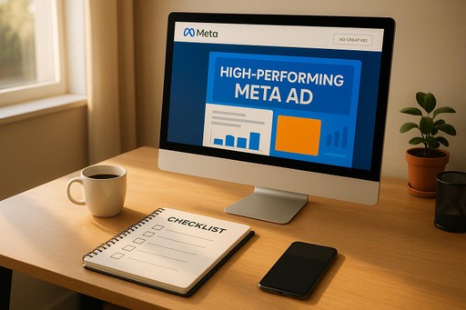
Ultimate Guide to Landing Page Design for Meta Ads
Landing pages are the backbone of successful Meta Ads campaigns. Without a focused, tailored page, your clicks won’t convert into customers. Here’s the bottom line: a great landing page aligns perfectly with your ad, keeps visitors engaged, and drives them to take action. Why does this matter? Because rising costs in Meta Ads mean you need higher conversion rates to stay profitable.
Key Takeaways:
Match ad to page: Ensure your landing page reflects the ad’s promise (e.g., if your ad offers "50% off skincare", the discount should be front and center).
Focus on one action: Remove distractions like menus or extra links. Guide visitors to a single, clear call-to-action (CTA).
Optimize for mobile: Many Meta Ads clicks come from mobile users. Fast load times, clear CTAs, and easy navigation are critical.
Build trust: Use testimonials, trust badges, and clear privacy policies to reassure visitors.
Test and improve: A/B test headlines, CTAs, and visuals to find what converts best.
A high-converting landing page doesn’t just look good - it delivers results. Every element, from the headline to the form, should work toward turning clicks into customers.
Core Principles of Effective Landing Page Design
The success of a landing page often hinges on a few straightforward yet essential principles. These principles are the backbone of high-converting pages, ensuring your landing page delivers on the promise made in your ad and keeps the momentum going.
Clarity and Relevance
Your landing page should feel like a natural extension of your Meta Ad, not a confusing detour. If your ad promises "50% off premium skincare", visitors expect to land on a page with that 50% discount front and center - not a general company history or unrelated content. This immediate alignment builds trust and keeps visitors engaged.
To achieve this, match your landing page's visuals, tone, and messaging to your ad. Visitors form quick impressions, and any mismatch can send them clicking away. Start with your primary value proposition - the main reason someone clicked your ad - right at the top. Follow it with supporting details that reinforce the offer and why it's worth acting on.
Tailor your messaging to the audience your ad targeted. For instance, if your ad speaks to busy parents, emphasize time-saving benefits. If you're targeting tech-savvy professionals, dive into the technical details they care about. The more relevant your page feels, the more likely visitors are to stick around.
Single-Action Focus
A great landing page has one job: guiding visitors toward a single, clear action. To do this effectively, eliminate distractions like navigation menus, sidebars, or extra links that could lead visitors away from your goal. Every element on the page should work together to direct attention to your call-to-action (CTA).
Avoid overwhelming visitors with too much information. Instead, focus on the most persuasive reasons they should act now. Highlight your key benefits and keep the message straightforward. Multiple options or competing messages only dilute the impact.
Your CTA button is critical. Make it stand out visually and use action-driven language that feels specific and urgent. For example, instead of generic phrases like "Submit" or "Learn More", go for something like "Claim My Discount" or "Start My Free Trial." Ensure the button is easy to tap on mobile devices and placed where visitors naturally look.
Also, think about what happens after someone clicks your CTA. The process should be quick and simple, with as few steps as possible. Long forms or complicated processes can lead to drop-offs, so stick to the essentials.
Mobile-First Design
Since Meta Ads often drive significant mobile traffic, optimizing your landing page for mobile is non-negotiable. A seamless mobile experience ensures your visitors stay engaged, no matter where they are.
First, focus on page load speed. Mobile users are often on slower connections, and they won’t wait for heavy images or flashy animations to load. Compress images, streamline your code, and prioritize content that appears above the fold.
Design your mobile layout with usability in mind. Key elements - like your headline, value proposition, and primary CTA button - should be immediately visible without scrolling. Make sure form fields are big enough for easy typing, and buttons are large enough for thumb navigation.
Finally, consider the context of mobile users. They could be browsing on the go, multitasking, or in a hurry. Use short paragraphs, bullet points, and a clear visual hierarchy to make your content easy to scan. Always test your page on real mobile devices to catch any issues that might not show up in desktop previews.
A well-optimized landing page doesn’t just look good - it works seamlessly, guiding visitors toward the action you want them to take.
Key Components of High-Converting Landing Pages
Creating a landing page that turns visitors into customers requires more than just good design. It’s about crafting an experience that delivers value and builds trust while guiding users toward action. Let’s break down the essential elements that help maximize conversions.
Headlines and Unique Selling Proposition (USP)
Your headline is the first thing visitors see, so it needs to grab their attention instantly. It should tie directly to your Meta Ad and clearly highlight the benefit they’ll get by staying on the page. The goal is to convey your unique selling proposition (USP) - the specific advantage that makes your offer stand out.
For example, instead of a vague headline like "Premium Software Solutions", try something more specific and benefit-driven, such as "Save 10 Hours a Week with Automated Workflows." This approach not only captures attention but also sets clear expectations.
Keep your headline short and easy to scan. Use concrete details when possible - numbers or specific outcomes make promises feel more real. A strong subheadline can expand on the main idea, addressing potential concerns or emphasizing urgency without simply restating the headline.
Experiment with different headline styles. Sometimes a question can spark curiosity, while a straightforward statement might work better in other cases. Whatever approach you choose, make sure it’s concise and compelling.
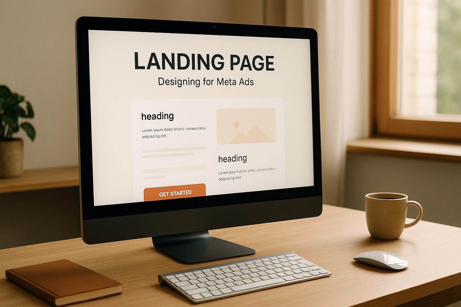
Hero Media: Images or Videos
The visuals on your landing page should do more than just look good - they need to support your message. Whether you use images or videos, the goal is to reinforce your value proposition and help visitors picture themselves benefiting from your product or service.
If you’re showcasing a product, show it in action. For instance, a productivity app might feature a video of its interface with real-world data. Physical products should be shown in relatable settings that align with your audience’s lifestyle.
Videos can be particularly effective, but they need to be short, engaging, and valuable - even when muted. Make sure they load quickly to avoid frustrating your audience.
Avoid generic stock photos that lack personality. Instead, use images that reflect your brand and resonate with your target audience. Authentic visuals that feel relatable can create a stronger emotional connection.
Lastly, optimize all media for fast loading without sacrificing quality, and include alt text to ensure accessibility for all users.
Social Proof and Trust Elements
Visitors are more likely to convert when they see proof that others have already benefited from your offer. Social proof helps reduce uncertainty and builds confidence in your brand.
Testimonials are a great way to showcase this. The most effective ones are detailed and relatable. Instead of generic praise like "Great product!" aim for stories that highlight specific results. Including a customer’s name, photo, or company adds credibility. If privacy is a concern, you can use a first name and last initial or just the company name - with permission, of course.
Trust badges and security certifications are also key, especially if your page asks for sensitive information. Displaying these near your forms can reassure visitors. For B2B audiences, showing industry certifications or partner logos can further boost trust.
If you can, include specific numbers or metrics in your testimonials to make them even more persuasive. If large figures aren’t available, focus on the quality of the story instead. Reviews from platforms like Google or Trustpilot, as well as industry awards, can also provide valuable external validation.
Strong Call-to-Action (CTA)
The call-to-action (CTA) is where conversions happen, so it needs to stand out. Everything from the button’s color to its wording plays a role in driving action.
Choose a color and design for your CTA button that makes it pop without clashing with the rest of the page. Test different options to see what resonates most with your audience.
The button text should be action-oriented and specific. For example, "Get Started" is more engaging than "Submit", and "Start My Free Trial" is even better because it reminds users of the benefit they’ll get. Tailor the wording to fit your audience - for example, "Request Demo" for B2B or "Claim Discount" for consumer-focused offers.
Place your primary CTA above the fold so it’s immediately visible, but include a secondary CTA further down the page for those who need more information before deciding. If your offer has a deadline or limited availability, mentioning that can encourage quicker action - just make sure the urgency is genuine.
Simple and User-Friendly Forms
Complicated forms can kill conversions. Keep things simple by only asking for the essentials, like a name and email. The less effort required, the more likely visitors are to complete the form.
Design matters here. Input fields should be easy to type in, especially on mobile devices, and labels should be clear. Use placeholder text to guide users, and group related fields logically to create a smooth experience.
For more complex processes, consider progressive profiling. Start with a basic form, then gather additional details later through follow-ups or a thank-you page. This reduces the initial barrier while still allowing you to collect useful information.
Make sure error messages are clear and helpful. Inline validation that highlights issues as users type can prevent frustration. Also, ensure your forms work seamlessly with browser auto-fill and password managers by using standard field names.
Advanced Strategies to Improve Landing Page Performance
Once you've nailed the basics of landing page design, it's time to dig deeper. These advanced strategies can help you fine-tune your landing pages, delivering better results from your Meta Ads campaigns through data-backed decisions and personalized experiences.
A/B Testing for Conversion Improvement
A/B testing is a powerful way to boost your conversion rates. The key is to test one variable at a time, allowing you to pinpoint what drives changes in performance.
Start with headline variations. Experiment with different messages, whether it's a value proposition, an emotional appeal, or a sense of urgency. For example, compare "Transform Your Business in 30 Days" with "Join 10,000+ Companies Already Growing Faster." Let each test run for at least a week or until you hit around 100 conversions to gather meaningful data.
Next, test visual elements, like hero images or video thumbnails. A product shown in action might resonate more than a static image of the product by itself. Small tweaks in layout or imagery can lead to noticeable differences in engagement.
Don't overlook your call-to-action (CTA) buttons. Test variations in color, size, and wording. For instance, "Start Free Trial" could perform better than "Get Started", but you won't know until you try.
Even the length and complexity of your forms matter. Compare a simple email-only form with one that also asks for a name. You might also test optional fields versus required ones. Sometimes, even small changes - like labeling a field "Work Email" instead of "Email Address" - can impact completion rates.
For accurate results, run your tests during consistent timeframes and account for factors like holidays or industry events that could skew data. Most testing tools will calculate statistical significance for you, but aim for at least a 95% confidence level before making permanent changes.
Use the insights from these tests to refine your landing page further, and consider layering in dynamic content for even greater engagement.
Personalization with Dynamic Content
Dynamic content takes your landing page to the next level by tailoring it to each visitor. This personalized approach creates a sense of connection, which naturally encourages higher engagement and conversions.
You can personalize by updating local contact information, regional offers, or device-specific layouts. For example, a roofing company might display "Serving Dallas and Surrounding Areas" to a visitor from Texas, while showing "Trusted by Denver Homeowners" to someone in Colorado. Mobile users might see shorter headlines and prominent call buttons, while desktop visitors get more detailed product descriptions.
Aligning your landing page with specific ad campaigns ensures a seamless experience. If your Meta Ad promotes "small business solutions", your landing page should focus on small business benefits, rather than generic corporate messaging.
You can also use time-sensitive personalization to create urgency. Adjust your content based on the time of day, the day of the week, or how long someone has been on your email list. For instance, new visitors might see introductory offers, while returning visitors are greeted with loyalty rewards.
Start simple, like personalizing based on location or traffic source, and gradually add more complex rules as you gather data on what resonates with your audience [1]. These personalized tweaks can have a big impact and set the stage for even more precise optimizations.
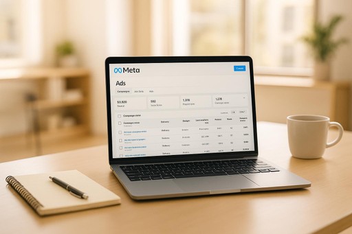
Real-Time Analytics and Insights
Real-time analytics give you the ability to make quick adjustments and uncover long-term trends. A well-optimized analytics setup can provide immediate feedback while also helping you plan for the future.
Heat mapping tools are a great starting point. They show where visitors click, scroll, and linger on your page. This can uncover surprising insights, like users attempting to click on non-clickable elements or failing to see your main CTA because they don't scroll far enough.
Go beyond basic conversion tracking. Monitor micro-conversions - actions like video plays, scroll depth, or time spent on the page. These metrics provide a clearer picture of the user journey and help you identify where visitors lose interest before completing a conversion.
During high-traffic periods or major launches, real-time monitoring becomes especially valuable. Set up alerts to notify you of sudden drops in conversion rates or spikes in bounce rates. This way, you can address issues immediately instead of waiting for post-event reports.
For businesses heavily invested in Meta Ads, advanced analytics dashboards can be game-changing. For example, Dancing Chicken's real-time analytics dashboard gives clients instant access to performance metrics, enabling quick, data-driven decisions without waiting for delayed reports.
Finally, attribution tracking is key to understanding which touchpoints drive conversions. With recent iOS privacy updates affecting pixel tracking, first-party data collection has become even more critical for accurate measurement.
Pair automated monitoring with regular manual reviews. Automated tools can flag major changes, but weekly deep dives into your data will help you spot trends and opportunities that algorithms might miss. This balanced approach ensures you're always refining your strategy for maximum impact.
Best Practices for Compliance and Localization in the US Market
Building trust and ensuring your Meta Ads run without a hitch starts with compliance. When targeting US consumers, understanding the specific legal requirements and cultural norms can make a big difference in how your landing pages perform. By aligning with these standards, you not only stay within legal boundaries but also create a user experience that feels familiar and trustworthy - key factors in driving conversions. At Dancing Chicken, we prioritize these principles to craft landing pages that meet Meta's policies and connect with local audiences.
Compliance with Meta Policies and Privacy Laws
Meta takes its advertising policies seriously, and failing to comply can lead to ad rejections or even account suspensions. Your landing page needs to align with your ad content and Meta's community standards.
Avoid content that could be flagged, like misleading claims, before-and-after photos without proper disclaimers, or overly optimistic promises of income. For example, if you're advertising a weight loss supplement, steer clear of dramatic transformation images unless they're paired with clear medical disclaimers. Similarly, business opportunity ads should avoid phrases like "guaranteed income" or "get rich quick."
Transparency is key when collecting user data. Make it clear what information you’re collecting and how it will be used. Place a privacy policy link near your form - don’t bury it in the footer. If you’re collecting emails, specify whether users are signing up for promotional content, newsletters, or both.
Cookie consent rules vary by state, with laws like California's CCPA and Virginia's CDPA requiring clear opt-out options for data sales. A straightforward cookie banner with clear "accept" and "decline" buttons can simplify compliance.
For industries like alcohol, tobacco, or financial services, age verification is a must. Include age gates or verification steps on your landing page, as Meta monitors the entire user journey. Additionally, certain sectors require extra disclaimers. For example, include FDA warnings for supplements or risk disclosures for financial products. These not only meet legal standards but also reassure cautious consumers.
Once compliance is in place, the next step is tailoring your content to meet the expectations of US audiences.
Localizing for US Conventions
American consumers expect certain formats and conventions, and straying from these can make your business seem less familiar - potentially affecting conversion rates.
Currency and dates: Use the dollar sign before amounts (e.g., $19.99) and commas for thousand separators (e.g., $1,299.99). Dates should follow the MM/DD/YYYY format (e.g., 12/25/2025), or when written out, "December 25, 2025."
Measurements: Stick to imperial units like miles, feet, pounds, and Fahrenheit. For example, a fitness page should say "lose 10 pounds" instead of "lose 4.5 kilograms", and real estate listings should use square feet rather than square meters.
Phone numbers: Format phone numbers as (XXX) XXX-XXXX and always include the area code. Offering a toll-free number can add a professional touch for national campaigns.
Spelling and language: Use American English spelling - "color" instead of "colour", "optimize" rather than "optimise", and "center" instead of "centre." For time-sensitive offers, include time zones (e.g., "Webinar starts at 2:00 PM EST") to avoid confusion.
These small adjustments show that you understand and respect the preferences of US consumers, which can go a long way in building trust.
Accessibility and Inclusive Design
After meeting compliance and localization standards, focus on making your landing page accessible to everyone. Accessibility isn’t just about following the Americans with Disabilities Act - it’s about creating a user-friendly experience for all visitors.
Visual design: Use high-contrast colors (minimum 4.5:1) and readable fonts. Avoid overly decorative or thin fonts, and keep font sizes at least 16px with 1.5 line spacing.
Alt text for images: Provide detailed descriptions like "woman using laptop at a coffee shop" instead of generic terms like "image." This benefits both accessibility and SEO.
Keyboard navigation: Ensure users can navigate forms and buttons using only the Tab key. Interactive elements should be easy to reach and clearly highlighted.
Form usability: Use descriptive labels for form fields and provide specific error messages (e.g., "Please enter a valid email address"). Helpful hints like "Password must be at least 8 characters" can improve the user experience.
Videos: Include captions for all videos. Auto-generated captions are a good start, but manually reviewing them ensures accuracy. For videos with important audio cues, consider adding audio descriptions.
Conclusion: Key Takeaways for Meta Ads Landing Page Success
Building landing pages that convert for Meta Ads goes beyond just creating something visually appealing - it’s about bridging the gap between your ad and your business objectives. Every detail, from the headline to the form fields, plays a part in turning clicks into customers.
Here’s what matters most: clarity is key. Visitors should immediately understand your offer and the action you want them to take. Keep your messaging aligned with your Meta Ad, use straightforward language, and make your call-to-action impossible to miss.
Don’t overlook mobile optimization. Your landing page must deliver a seamless experience on mobile devices. Test forms, buttons, and images to ensure they work smoothly on screens of all sizes. A clunky mobile experience can cost you conversions.
Trust signals are game-changers. Features like customer testimonials, security badges, clear contact details, and professional design can make or break a visitor’s trust. Social proof, in particular, has a powerful impact on conversions, showing potential customers they’re making a safe and smart choice.
Stay compliant to avoid setbacks. Meta has strict advertising policies, and non-compliance can result in ad rejections or account issues. Be transparent with your content, include necessary disclaimers, and make sure your privacy policy is easy to find. For US audiences, use familiar formats like MM/DD/YYYY dates and American English spelling.
Testing is your secret weapon. Your first version of a landing page likely won’t be your best. A/B testing different elements - like headlines, images, form lengths, and call-to-action buttons - can uncover what truly resonates with your audience. Even minor tweaks can lead to noticeable improvements in conversion rates.
When done right, Meta Ads campaigns combine engaging ad creative with landing pages that deliver on their promises. This connection not only drives conversions but also fosters long-term customer relationships.
At Dancing Chicken, we specialize in crafting landing pages that elevate Meta Ads performance. By applying the strategies outlined in this guide, you can create landing pages that don’t just convert - they leave a lasting impression. Your landing page is where the magic happens - make every click count.
FAQs
How do I make sure my landing page matches my Meta Ad to boost conversions?
To improve conversions, your landing page needs to align closely with your Meta Ad in terms of messaging, visuals, and call-to-action. This consistency creates a smooth experience for visitors, building trust and encouraging engagement.
Your landing page should address the same intent as your ad while speaking directly to your audience. Highlight a clear value proposition, ensure quick load times, and prioritize an easy-to-navigate design. For U.S. audiences, use familiar elements like USD currency, imperial measurements, and visuals that resonate culturally. Keeping everything aligned and focused can make a noticeable difference in your results.
How can I personalize landing pages to boost user engagement and drive conversions?
To make landing pages more effective, begin by dividing your audience into segments based on criteria like their behavior, location, or the type of device they're using. With this information, you can adjust key elements - such as headlines, visuals, and offers - to match the preferences of each visitor.
Try strategies like location-based targeting to showcase content relevant to a specific region, time-sensitive messages to encourage quick action, and tailored product recommendations to add a personal touch. These techniques not only grab attention but also boost the chances of conversions by creating a tailored experience that feels more meaningful to each user.
Why is mobile optimization important for landing pages, and how can you create a better mobile experience?
Mobile optimization is a must these days since a huge chunk of users access landing pages directly from their smartphones. If your page isn’t designed to work well on mobile, you’re likely to see more people leaving quickly and fewer conversions - both of which can drag down your campaign results.
To deliver a smoother mobile experience, focus on a few key elements: fast load times (aim for under 3 seconds), responsive design that adjusts to any screen size, and clean, simple layouts with clear visuals. When it comes to forms, make them easy to use by including large input fields, enabling autofill, and cutting down on unnecessary steps. These tweaks can go a long way in creating a seamless experience that keeps users engaged and drives more conversions.